Understanding the problem
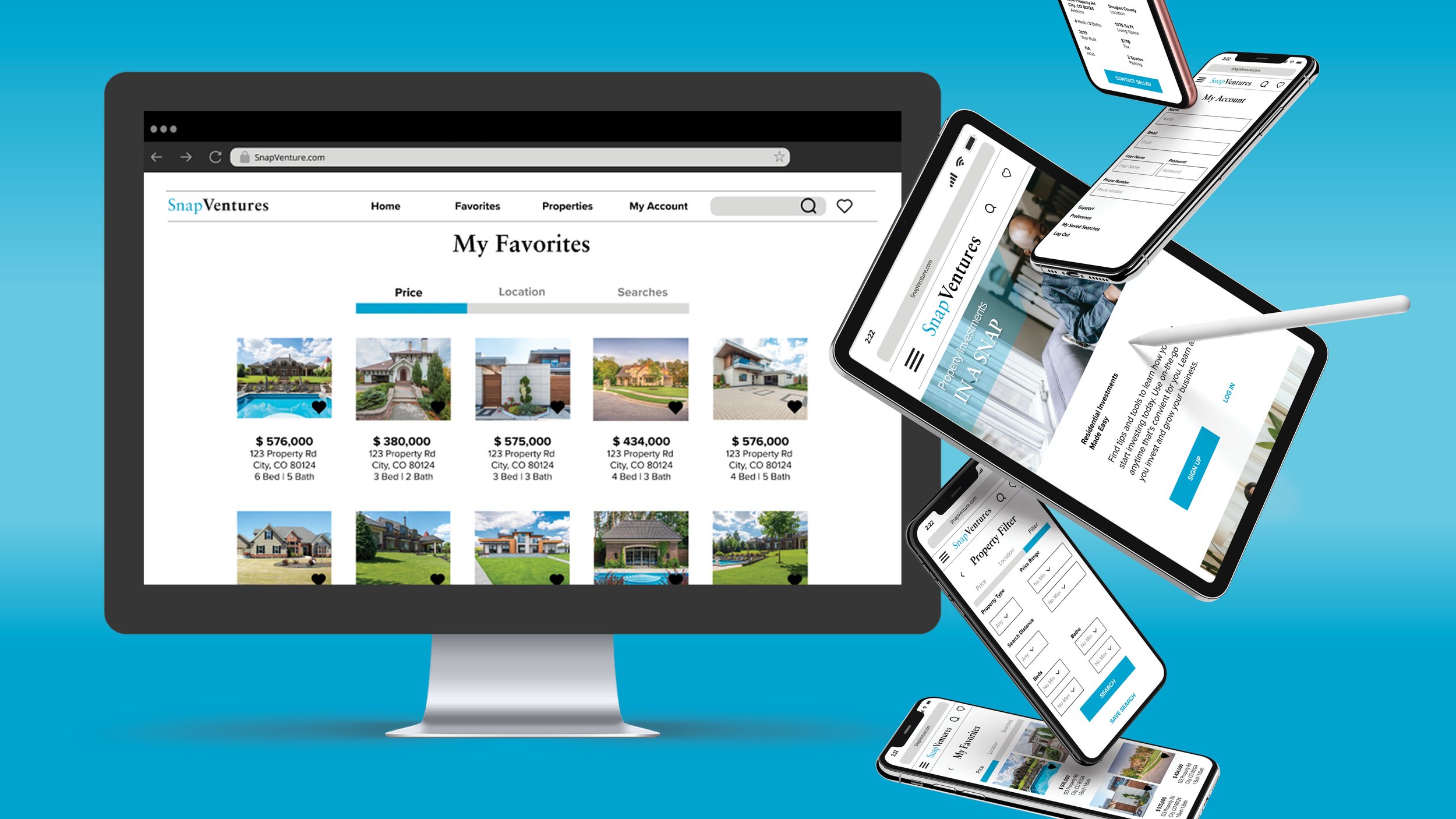
Real estate investment is an increasingly popular way for individuals to achieve financial security. It is an exciting and emotional experience, but often a complicated one. while there are plenty of blogs and agencies providing information, often, buyers new to the market may struggle to get started without professional guidance and end up wasting time viewing properties out of their financial range. This web app will provide them with the expertise needed to get started efficiently.
My Role: UI Designer
Timeline: September - October 2022
Tools: Figma, Adobe Illustrator, Adobe Photoshop, Adobe Indesign
The Process
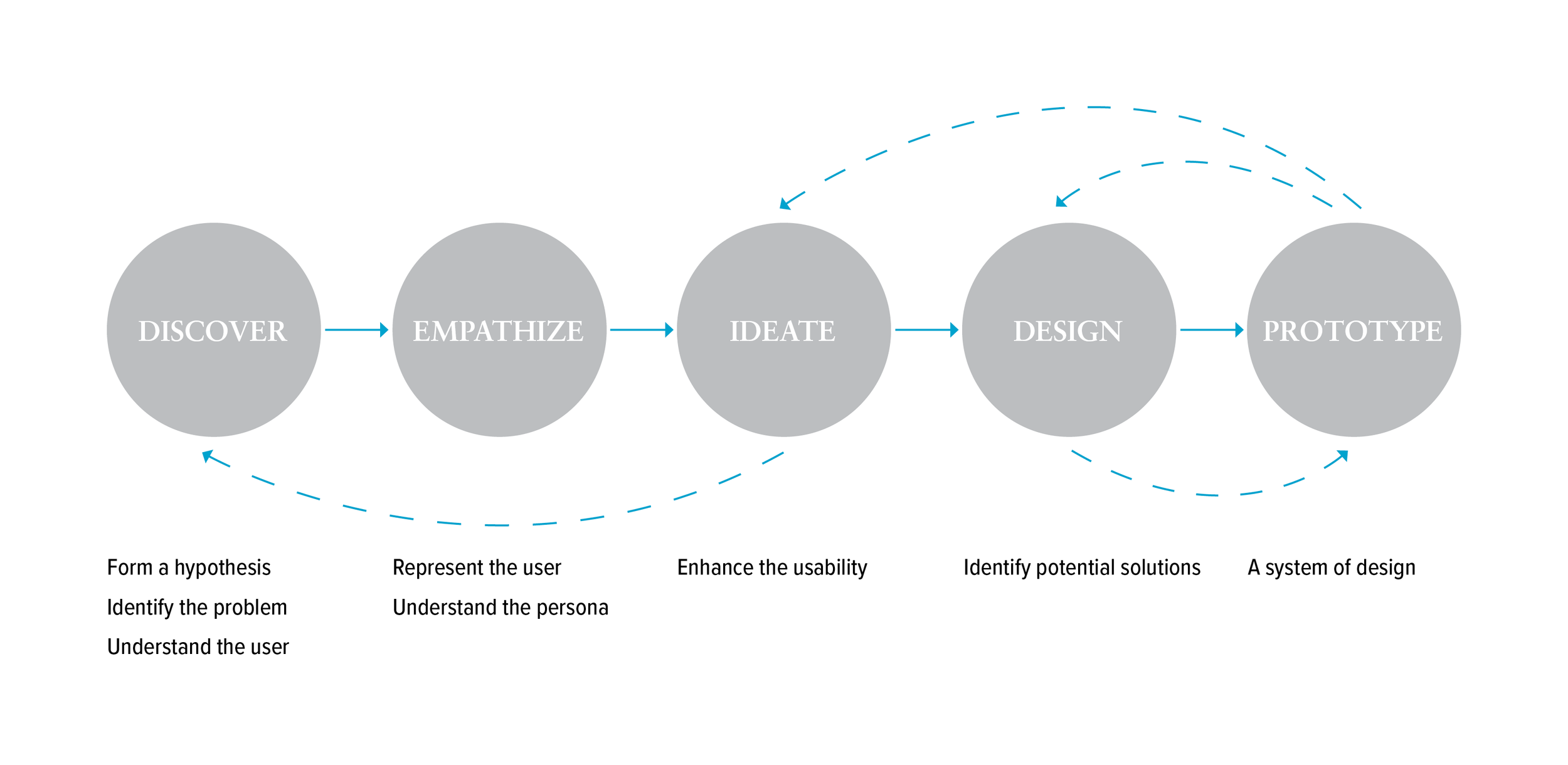
The Design Thinking Process
01. Discover
Objective
A responsive web app that provides potential buyers with information on available residential real estate properties of interest
Primary User: This web app is made primarily for new, small-scale buyers who are looking to invest for additional income or financial security
Primary Use Case: Buyers will use this tool when conducting property searches, and when making a decision about where to invest
02. Empathize
To gain a better understanding of the users’ needs, goals and motivations, I create a proto-persona from the information provided in the design brief
Persona
03. Ideate
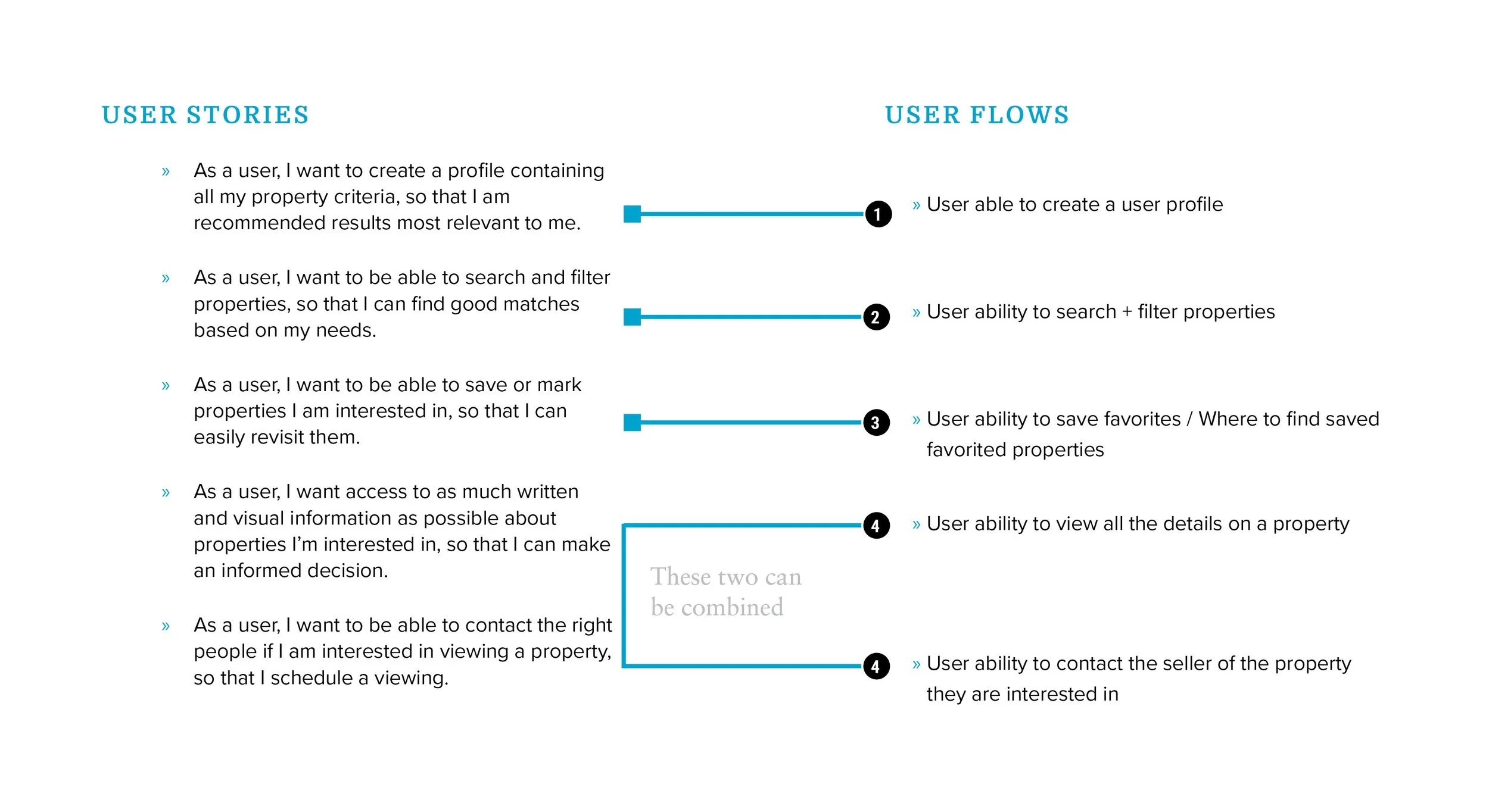
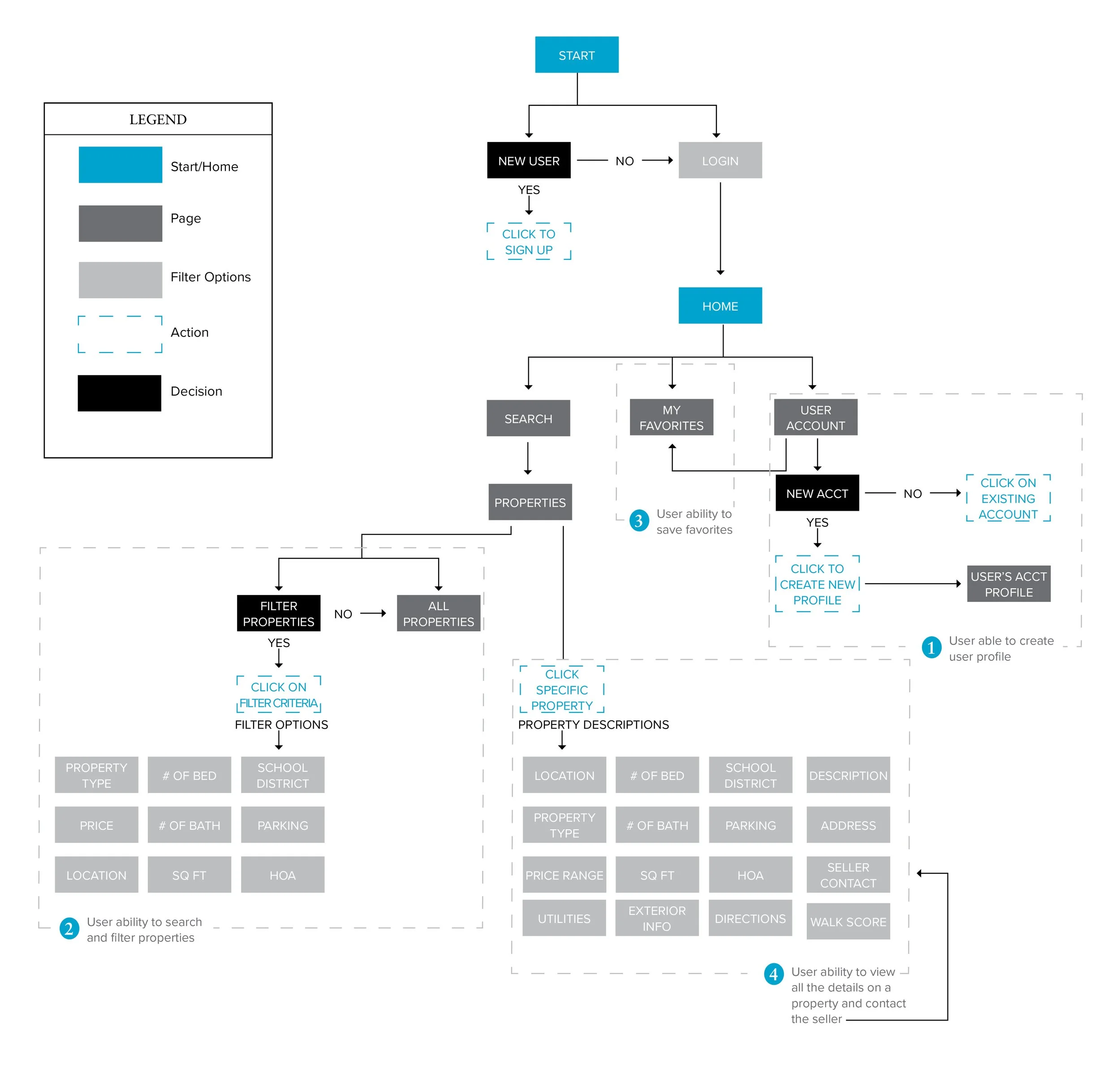
To understand how the users’ stories provided in the project brief translated into users’ needs, I accessed how their stories translated into user flows. I then created a user flow diagram to better understand what pages were needed in the application in order for users to achieve their goals.
User Stories to User Flows
User Flow Diagram
04. Design
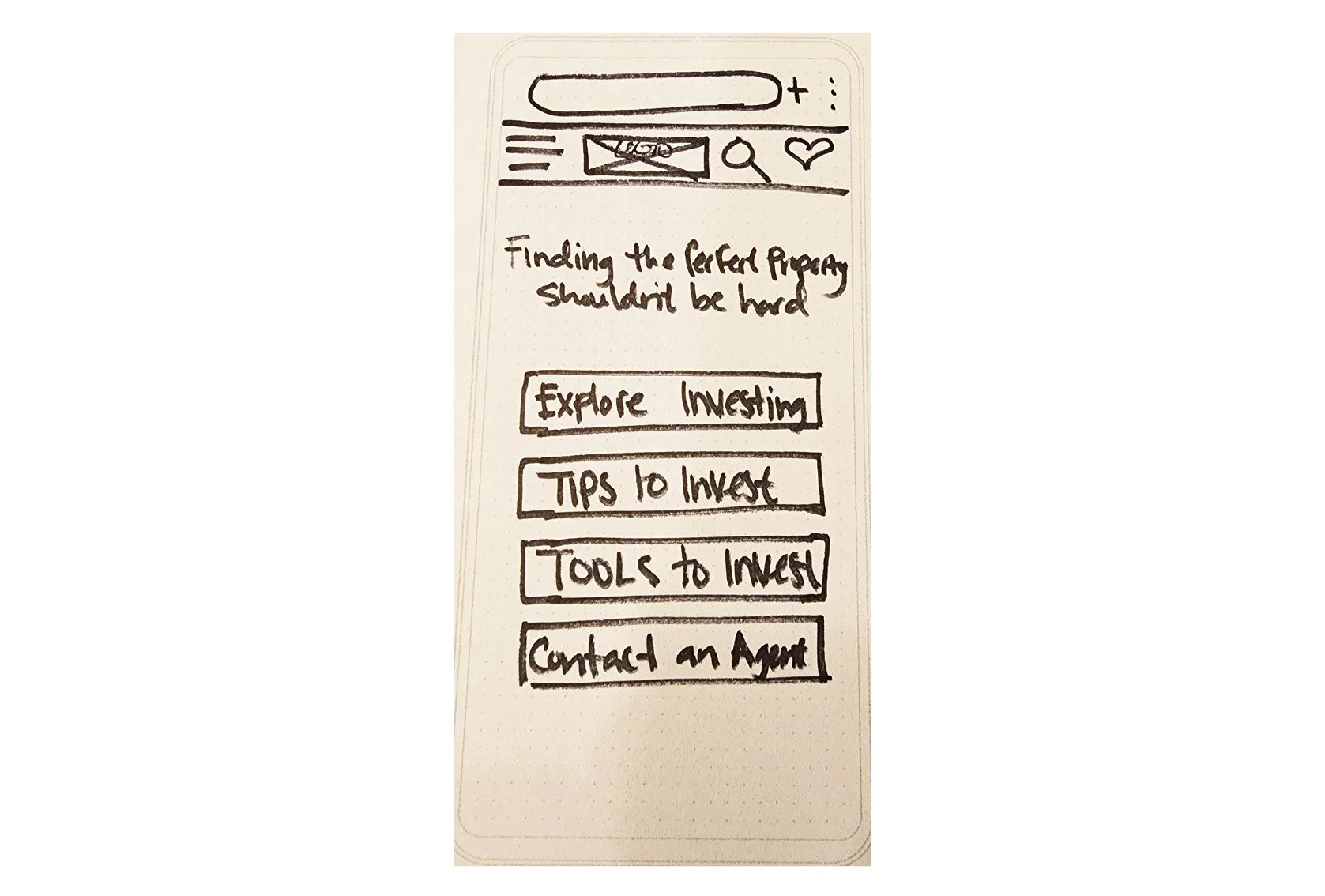
Using the information gained through transforming the user stories to user flows and the proto-persona, I could then begin transforming the information architecture into a designed package with a set look and feel. I started this process with paper sketching; identifying the users’ needs to gain a better understanding of how users would interact with the main tasks in the application. I then moved into mid-fidelity wireframes and further into high-fidelity and specifying a brand look and feel.
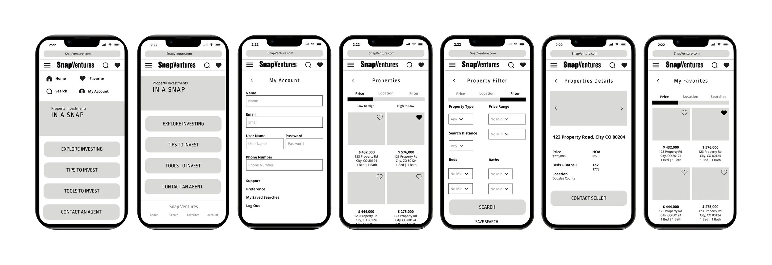
Paper Sketching + Low-Fidelity Wireframes
Low-Fidelity Responsive Breakpoints
Mobile Home Screen
Tablet Home Screen
Desktop Home Screen
Mid-Fidelity Wireframes
At this point, I began to add common UI elements, text, titles and the logo to fill in how the design would layout and function. I also checked for any improvements that could be made to the design for accessibility issues such as larger touch points and title for form fields to help with visibility issues.
Creation of High-Fidelity + Responsive breakpoints
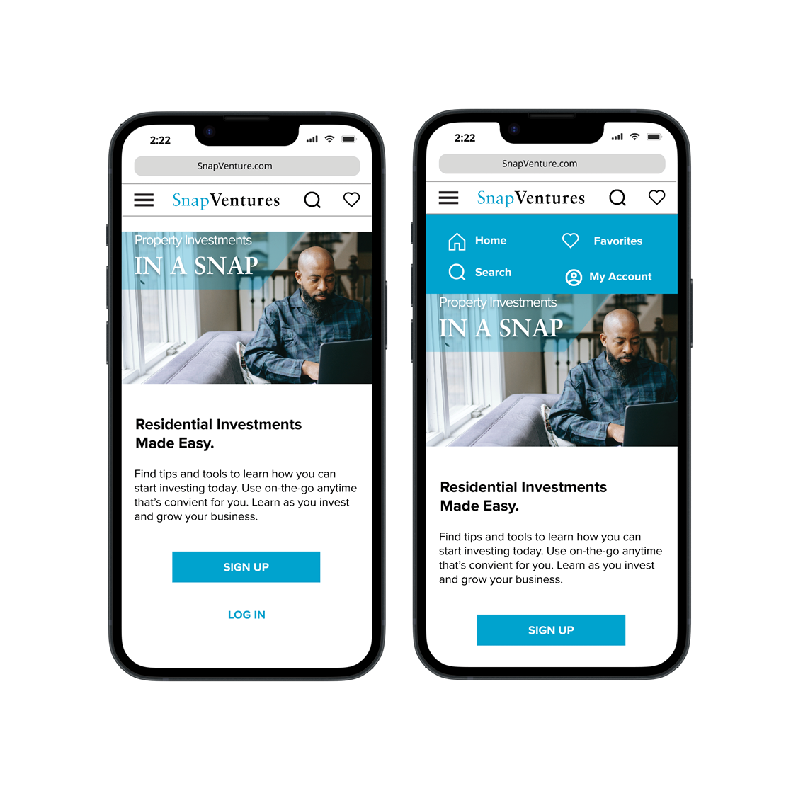
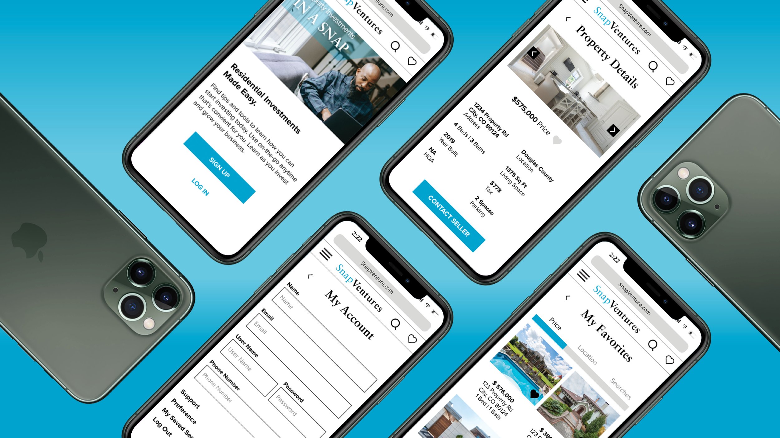
Home page
On the home screen the user can easily sign up or log in so they can access saved searches. This will cut down on time for the user to shift through properties and also help them easily find properties they want to go back and look at later. The user will also be able to learn more about investing in properties and have access to helpful guides and tools.
My Account
This features allows the user to save their information and access those saved property searches to ensure they don’t miss an important investment
Properties
This feature allows the user to search through thumbnails of available properties, showing a snippet of information about each property and a visual photo to help gain interest quickly at first glance. The user can also filter their search by low or high price, location or more detailed filter options. It also allows the user to dive deeper by clicking into the thumbnail to access property details with more key information about each property. This will help the user make a more informed decision about whether this property is a good investment for them and allow them to contact the seller if they are interested.
My Favorites
This page shows the user all their saved favorite properties. The user is able to save these properties by clicking on the heart icon in the bottom right-hand corner while they are searching the Properties page. All these saved properties are then grouped together and saved to this My Favorites page which the user can access via their account.
Responsive break Points
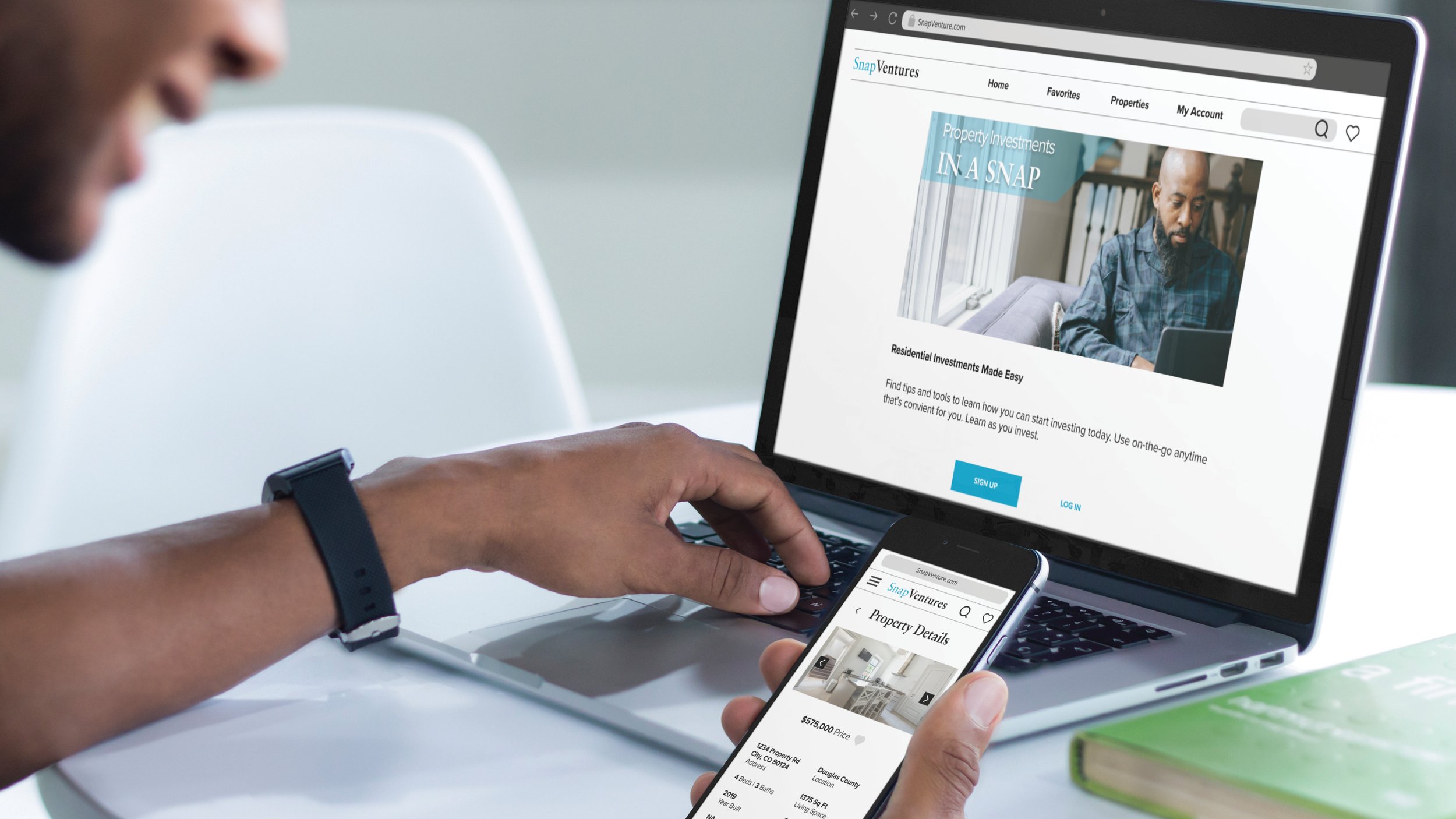
In order for the user to have the information displayed in an easy to read and easy to access manner, breakpoints at the mobile, tablet and desktop sizes were implemented. The user can search properties displayed at sizes that make sense for the device in which they are viewing the information. Many user will likely be on the go and therefore viewing on a mobile device.
Responsive web application with various breakpoints
Style Guide
To further the process of setting specifics for the brand, a style guide helps to create do’s and don’ts as well as a guide for how the brand should look, speak and function
Logo
Full Color
One Color
Reverse Color
Typography
Sabon LT Pro Bold
Headlines
Proxima Nova Regular
Subheadlines & Body Copy
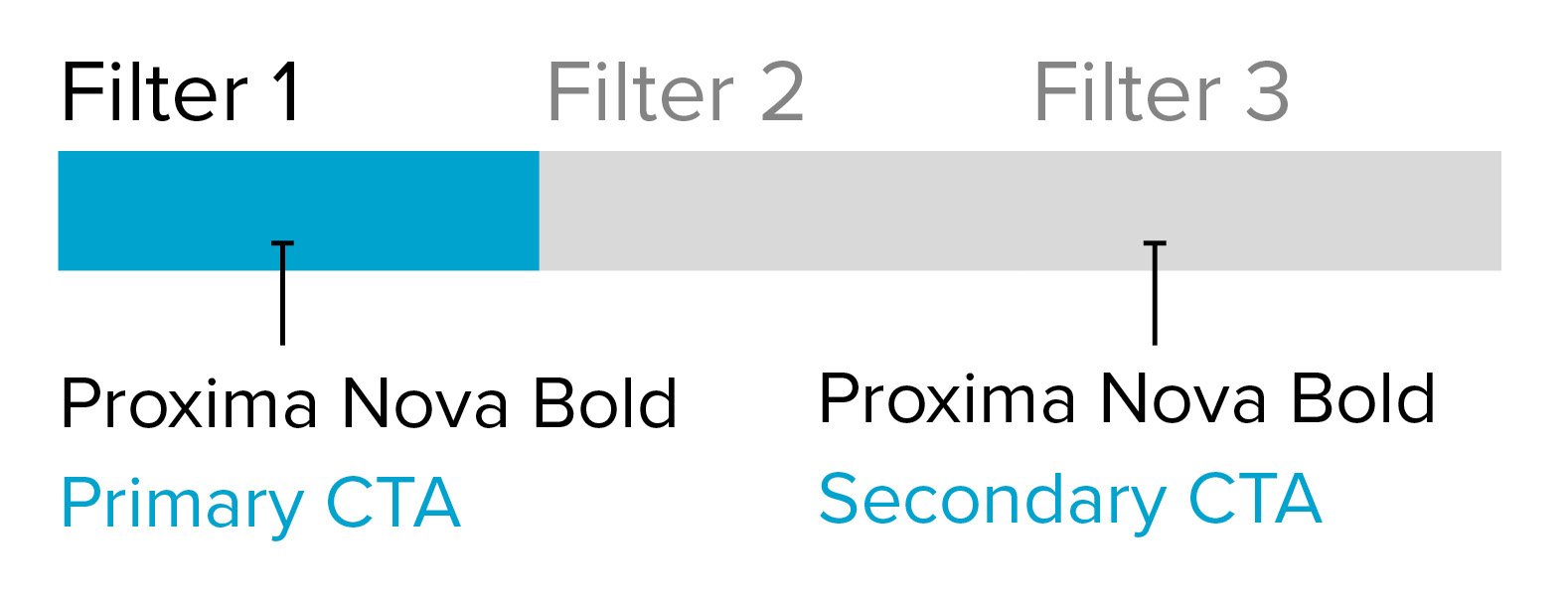
Proxima Nova Bold
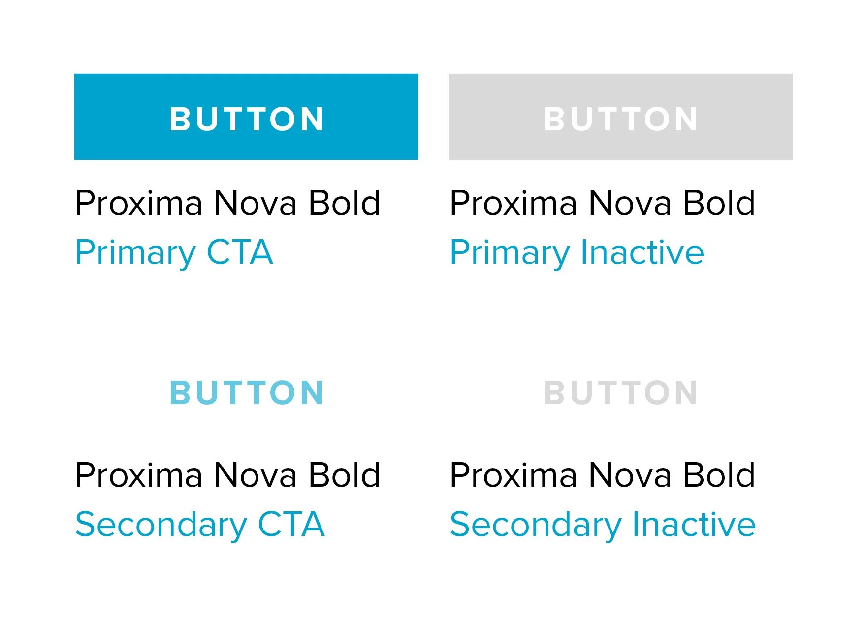
CTAs Uppercase
Color Palette
Iconography
Basic Icons
UI Elements
Favorites Status
Top Navigation Favorites Icon
Inactive Favorites Icon
Active Favorites Icon
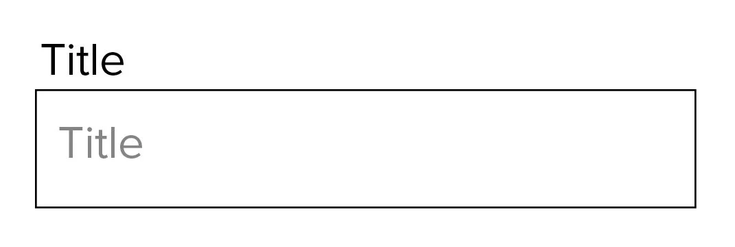
Forms
Filters
Buttons
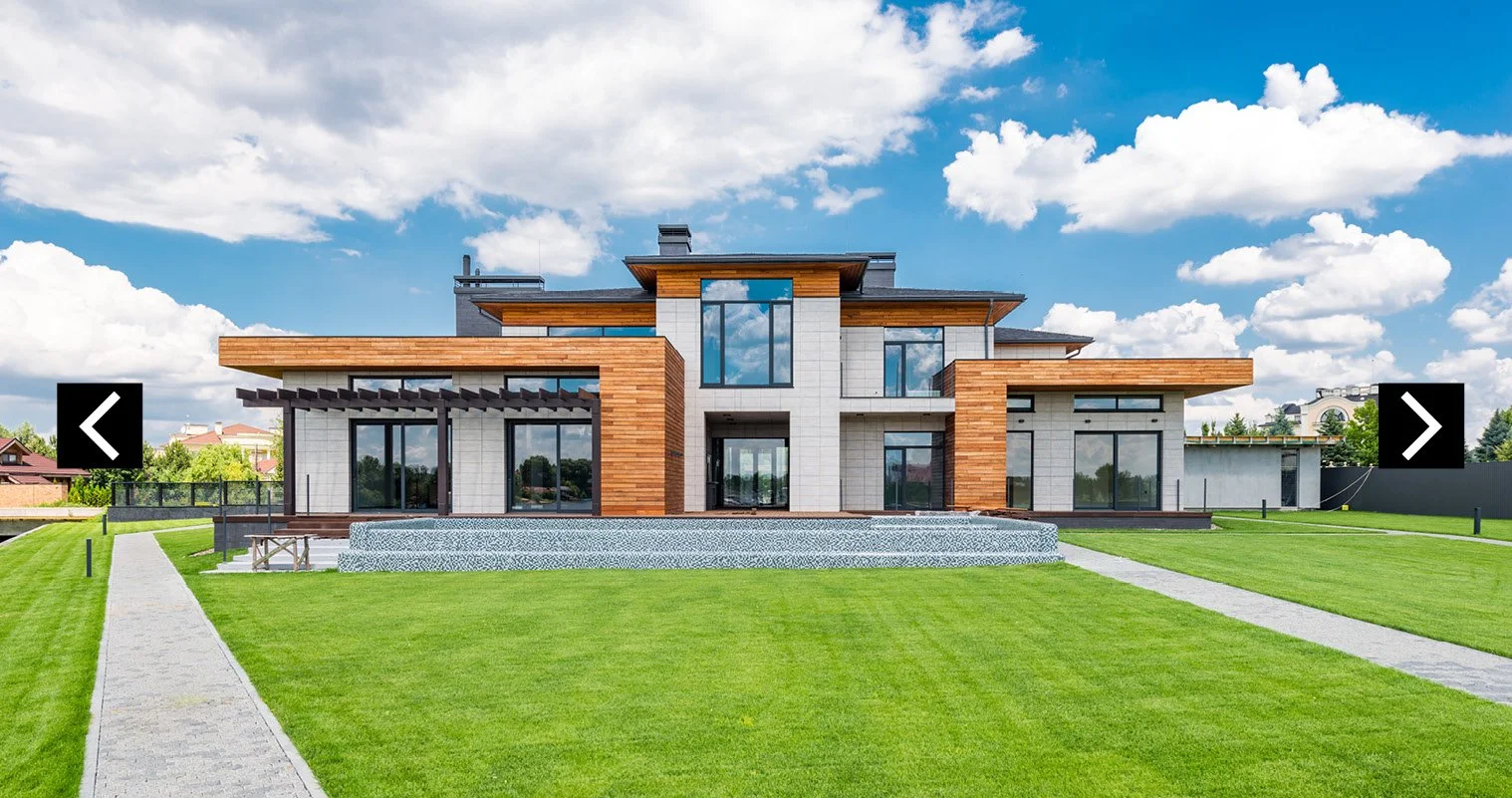
Photo Carousel
Right & Left Arrows
Black background for legibility purposes on top of photos
Imagery
Photography with a Human Element
Imagery should convey a trusted and sophisticated brand that helps individuals looking to invest in residential real estate to help increase their own financial security
Photography throughout should incorporate a person(s) into the image to reflect the human nature of the business. This person(s) should be in the foreground, smiling or working diligently with either real estate , on the go, co-working space or interior personal space in the background. This imagery should help to drive the narrative of the satisfaction people attain being able to become more independent in their financial security and that it is a human centered product that can be used easily whenever and where ever they need.
Home Investment Photography
The interior and exterior photography on each individual property will most likely be taken by the selling agent or the selling owner for each individual property and therefore cannot be maintained by the brand. But when access is granted use photography that feel clean, simple and employs white/negative space.
click here to check out the full style guide
05. Prototype
Click here to view Figma prototype
06. Conclusion + Next Steps
Creating UI design as a UX designer allowed me to gain valuable insight into how the visual design contributes to the overall users’ experience and how it all works together to ensure the user is experiencing a well thought out design. All of this benefits from research, insights, and visual cues to help direct the user throughout the overall experience.
Next steps:
Conduct user testing to identify areas of improvement for the overall design
Iterate + enhance the areas identified based on user feedback
Thank you so much for taking the time to view
To work together please contact at hello@kateoakleydesign.com


