AIRTHEREUM
Brand Play Book
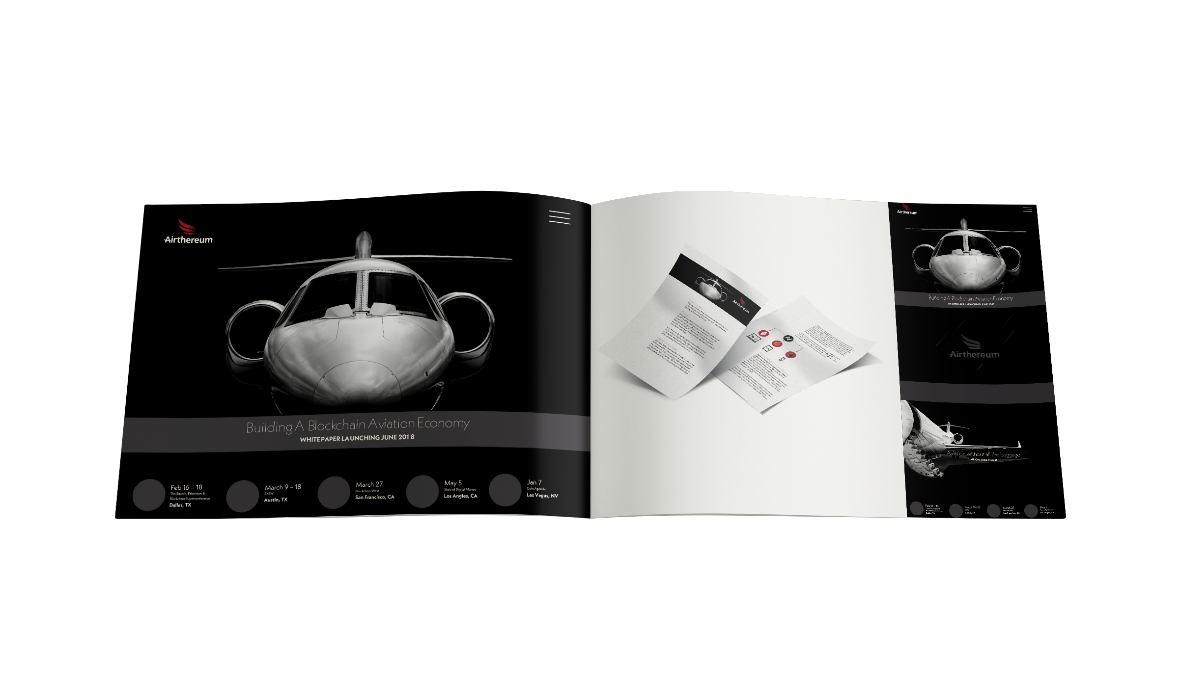
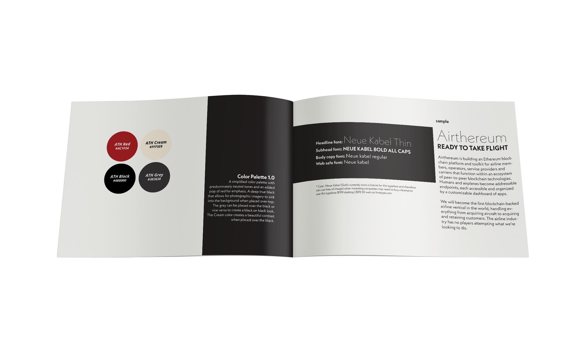
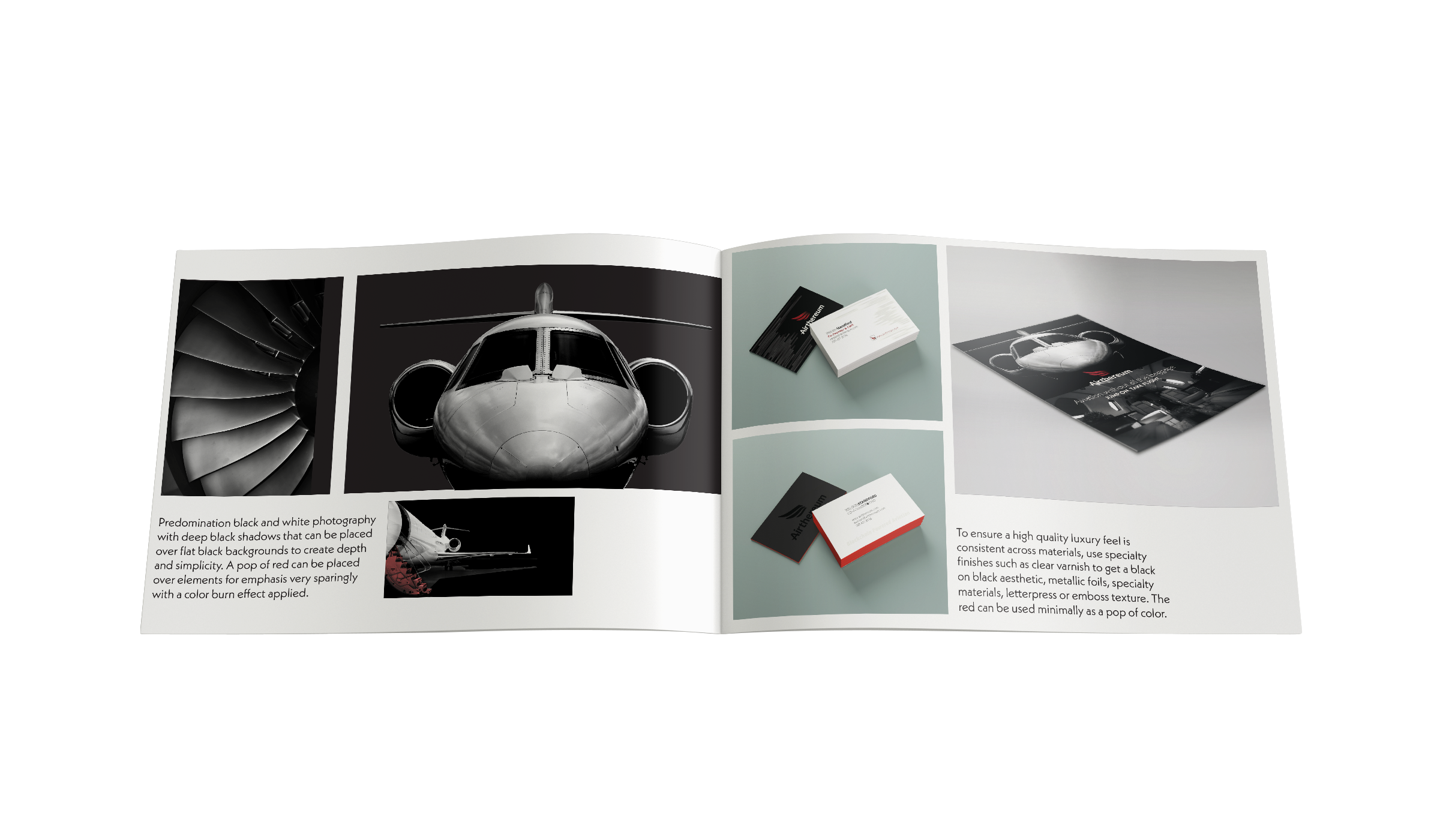
Design Option 1.0 A sophisticated and luxurious look with high contrast photography that sinks into rich black backgrounds and ample amounts of negative space to give an open feel. Red color and transparencies were added to give the design a pop of color when emphasis was needed. I also recommended specialty finishes to any printed materials to add quality queues to the brand.
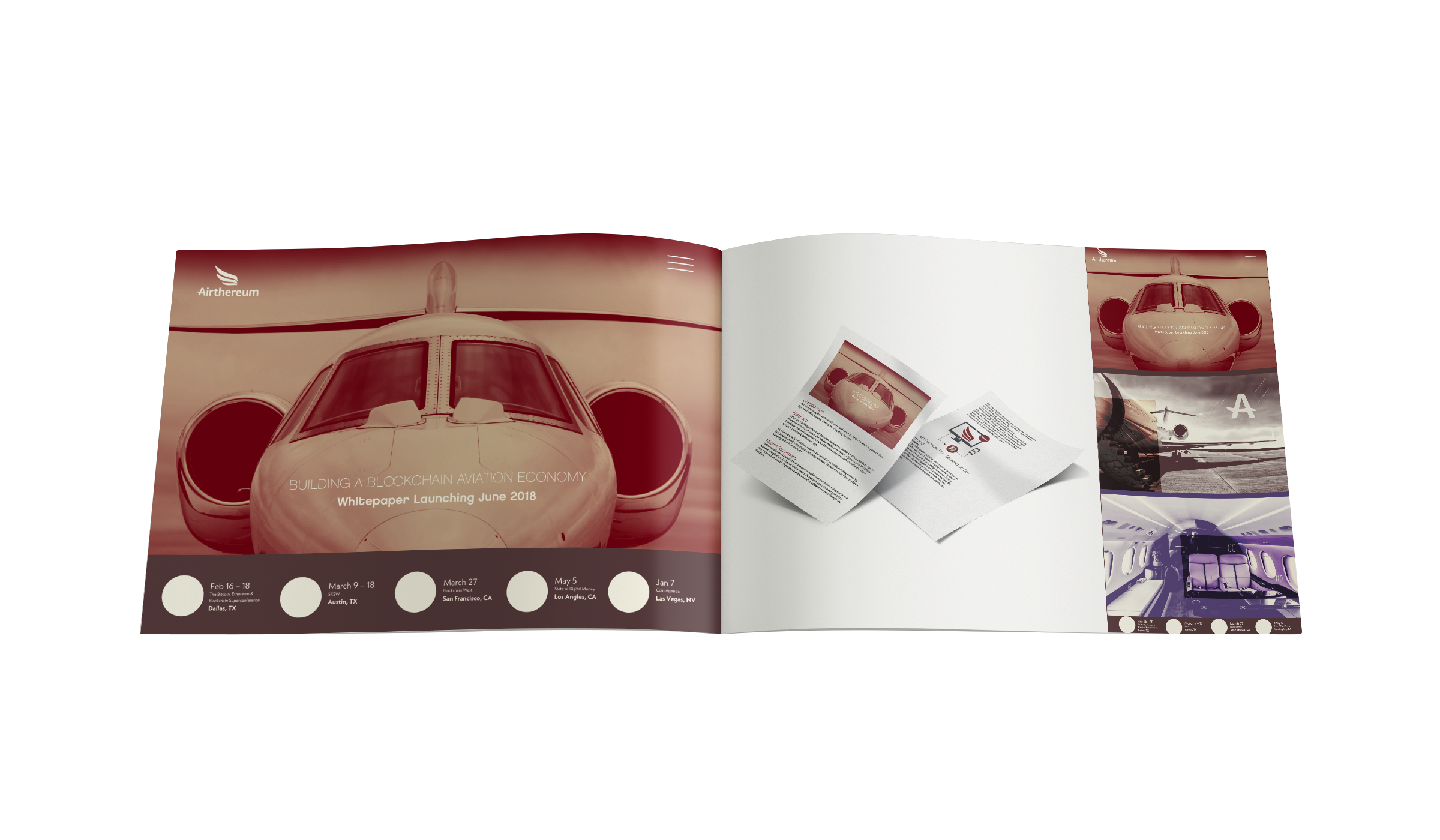
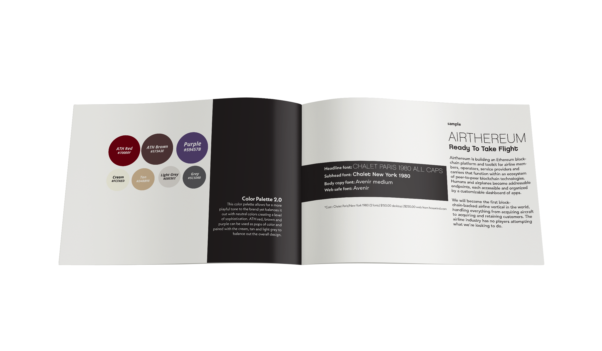
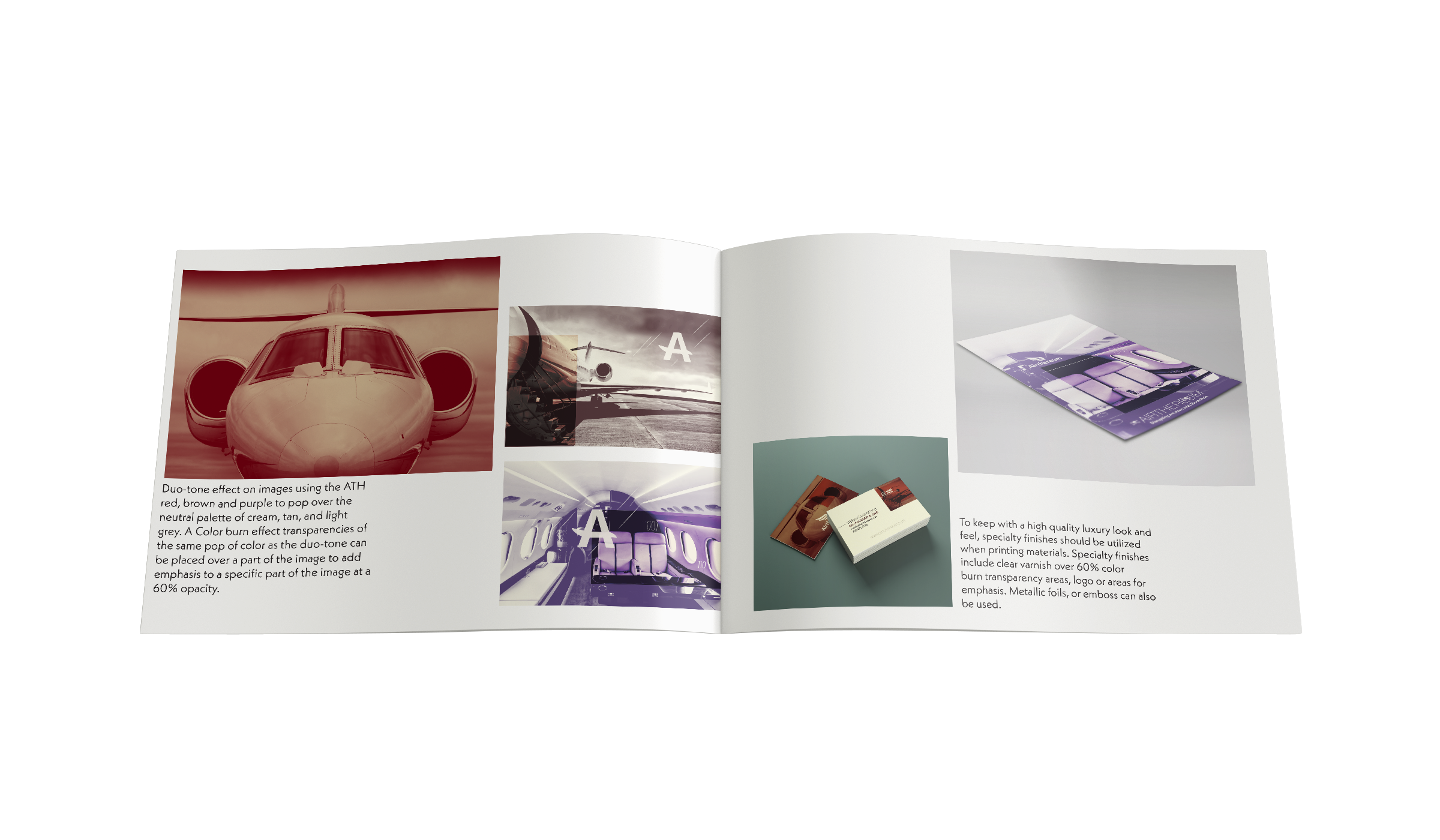
Design Option 2.0 A more playful tone and color palette. Big photographic imagery paired with a duo-tone treatment and pops of color. This design also used Nouveau type styles and added graphic elements to the brand.
Airthereum is a startup company in the blockchain and cryptocurrency industry. When they came on as a client, all they had was a logo and white paper. My team and I first did research to nail down the target market for this space concluding it to be more of a psychographic rather than a demographic because many people in cryptocurrency are anonymous meaning we wouldn’t be able to identify a specific group but rather a mentality that these types of people value. We then fleshed out the purpose, vision, mission, values and personality of the company to drive our design decisions.
My role was to create a look and feel for the brand. My team and I designed two options for Airthereum to choose from. One sophisticated and luxurious and the other more colorful and playful.
AIRTHEREUM
Business Cards
Adhering to the brand standards guide for Airthereum, I created business cards that had a look and feel of luxury with an added element of raised spot gloss for that tactile and contrasting finish. The shape of the line elements gives a feeling of motion that speaks to the industry of the brand.

